Introduction:
Let’s be real—trends come and go. One year it’s all about bold jewel tones, the next it’s dusty pastels or high-contrast black and white. But if there's one design element that’s truly stood the test of time, it’s the power of neutral color palettes.
Neutral tones have long been the unsung heroes of interior design. They’re versatile, calming, and easy to layer with just about any accent you choose. Whether you're into modern minimalism, rustic charm, or cozy traditional, neutral colors lay the perfect foundation for a home that feels both stylish and inviting.
But don’t mistake “neutral” for “boring.” When done right, neutrals can be rich, textured, and full of character. This blog will walk you through some of the best neutral color combinations to achieve a timeless look that you’ll love for years to come—no matter how trends shift.
What Makes a Neutral Palette “Timeless”?
A neutral palette typically includes shades like white, beige, gray, taupe, cream, greige (gray + beige), and even soft black or navy. What makes these colors timeless is their:
- Versatility: They pair well with any design style
- Longevity: They don’t feel outdated with time
- Balance: They create a soothing, calm environment
- Flexibility: Easy to update with seasonal or trendy accents
The trick is to mix tones, textures, and finishes to keep things visually interesting. So let’s dive into some classic combinations that never go out of style.
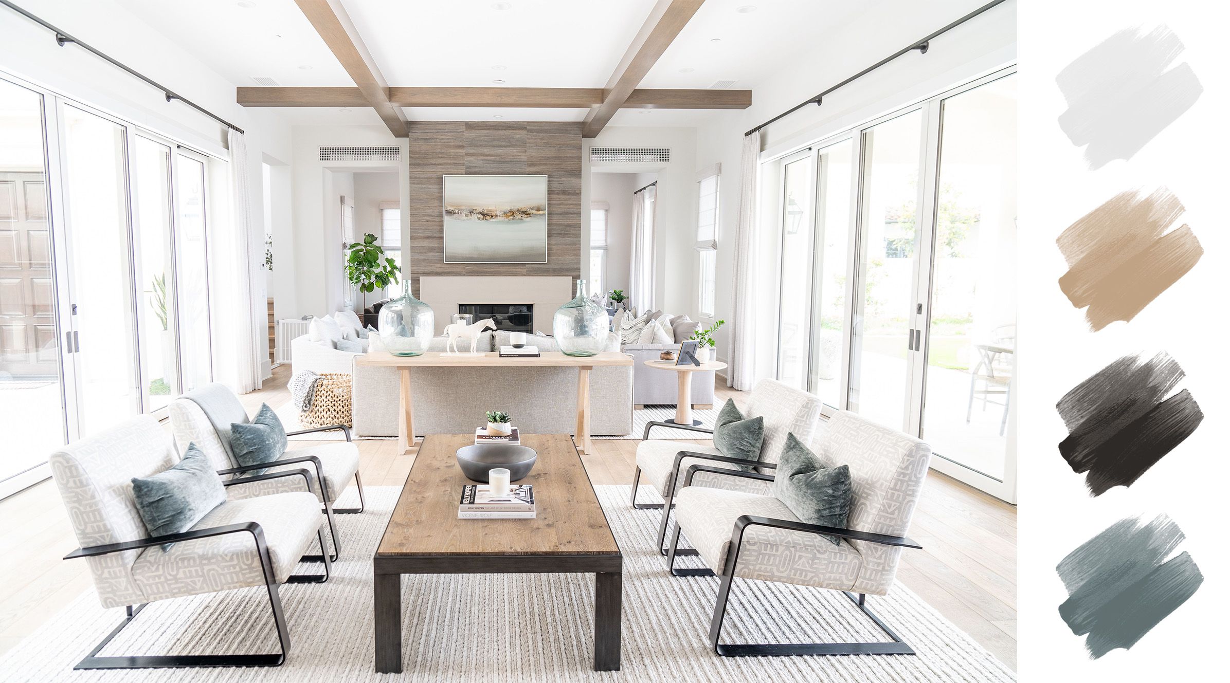
1. Classic White + Warm Wood Tones
There’s something eternally fresh about crisp white walls paired with warm wooden accents. Think Scandinavian design or farmhouse charm.
Why it works:
White keeps things light and airy, while the natural wood adds warmth and earthiness. Together, they create a balanced, peaceful space.
Perfect for:
- Kitchens with white cabinets and oak or walnut floors
- Living rooms with white walls and wooden furniture
- Bathrooms with white tiles and wood vanities
Design tip:
Add woven textures like jute rugs, linen curtains, or rattan baskets to make the space feel layered, not stark.
2. Beige + Cream + Soft Gray
This palette is the definition of understated elegance. Soft gray adds cool sophistication, while beige and cream provide warmth and depth.
Why it works:
These tones blend seamlessly and reflect light beautifully, making even small rooms feel spacious.
Perfect for:
- Bedrooms for a calming retreat
- Open-plan living spaces
- Traditional or transitional interiors
Design tip:
Use multiple textures—like velvet, wool, or brushed metals—to bring this trio to life.
3. Greige + White + Charcoal
Greige (a mix of gray and beige) is a modern neutral darling. It pairs well with both warm and cool colors, and it looks stunning when anchored with deep charcoal accents.
Why it works:
This combination feels fresh yet grounded. White keeps it clean, greige softens it, and charcoal adds contrast.
Perfect for:
- Living rooms with neutral furniture
- Entryways or hallways
- Contemporary interiors
Design tip:
Add black frames, dark pottery, or matte metal accents for visual weight and structure.
4. Taupe + Ivory + Sage Green
Earthy and elegant, this palette brings a whisper of color while staying neutral. Sage green is soft and natural, making it a favorite for creating relaxing spaces.
Why it works:
Taupe offers the base, ivory keeps it light, and sage adds a hint of personality without overpowering.
Perfect for:
- Bedrooms and guest rooms
- Bathrooms with a spa-like feel
- Rustic or vintage-inspired homes
Design tip:
Introduce greenery—real or faux—for added texture and harmony.
5. Warm Gray + Camel + Soft White
Warm gray acts as a cozy neutral, camel brings richness, and soft white keeps the space clean and open.
Why it works:
This trio offers a luxurious yet livable feel. It’s warm without being too yellow, cool without feeling stark.
Perfect for:
- Living rooms with leather or suede furniture
- Cozy reading nooks
- Neutral nurseries or guest bedrooms
Design tip:
Use plush fabrics like faux fur or cashmere to make the palette feel high-end.
6. Charcoal + White + Natural Linen
Love neutrals with a bit of drama? Charcoal adds depth, while white brightens and natural linen adds softness and texture.
Why it works:
This combo is timeless and chic—perfect for those who want a modern, minimalist edge without it feeling cold.
Perfect for:
- Kitchens with black cabinets and white countertops
- Modern bathrooms
- Urban lofts or industrial-style homes
Design tip:
Introduce matte black hardware or light fixtures to tie everything together.
7. Blush Beige + Off-White + Brass
For those who like their neutrals with a touch of warmth and glamour, this is your palette. The soft blush tones feel feminine and cozy, while brass finishes add elegance.
Why it works:
It adds subtle color without stepping too far outside the neutral zone, keeping things classy and current.
Perfect for:
- Bedrooms or vanity spaces
- Chic home offices
- Transitional spaces
Design tip:
Layer in marble or stone for added luxury
8. Mocha + Sand + Crisp White
This palette feels like a warm cup of coffee on a chilly morning. Mocha provides richness, sand keeps it soft, and white balances it all.
Why it works:
It’s neutral but full of character, offering both comfort and contrast.
Perfect for:
- Living rooms with deep sofas
- Dining spaces with wooden elements
- Cozy dens or home libraries
Design tip:
Add black or iron accents to modernize the look.
How to Keep a Neutral Space from Feeling Bland
Even with the most beautiful neutral palette, a room can fall flat without the right finishing touches. Here’s how to make your neutrals shine:
- Layer textures: Think chunky knit throws, smooth leather, sleek metals, and soft cottons.
- Vary finishes: Mix matte, glossy, and natural materials.
- Play with shapes: Curved furniture, asymmetrical mirrors, and unique lighting help add personality.
- Add contrast: Don’t be afraid of dark neutrals—they can anchor a space beautifully.
Conclusion:
Neutral color palettes are more than just a safe choice—they’re a smart, stylish, and flexible foundation for any home. With the right mix of shades and textures, neutrals can be anything but boring. In fact, they often end up being the most loved and lived-in parts of the home.
Whether you're starting fresh or refreshing an old space, a timeless neutral palette is always a good idea. It gives you the freedom to evolve your decor without constant overhauls—and keeps your home feeling cohesive and calm through every season.
So go ahead, embrace the beauty of simplicity. Because when it comes to creating a home you’ll love for years to come, neutral really is the new classic.